One of my favorite talks at SXSW this year was Andy Baio’s Worst Website Ever II. He asked a half dozen people to pitch their idea for the company most likely to fail spectacularly. Mike Lacher easily had the best pitch and he was kind enough to put it on the internet. Watch this and imagine constant laughter.
March 2011
This month I posted 5 entries, crafted 75 tweets, listened to 291 songs, watched 21 videos, bookmarked 40 sites, took 7 photos and favorited 81 things.
03/22/11 |
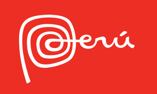
 Peru's New Logo
 Brand New takes a look at my favorite new logo of the year. The swirl of the P is wonderful and is 1000x more interesting than their previous logo. As part of the identity system, they’re also using Bree, which is a font I nearly used on Capn Design.
03/22/11
Mike Monteiro discusses the need to be picky with your partners. Sure, everyone needs to keep the lights on, but finding the right clients will make everyone happier. I found this bit most interesting.
I’m wary of working with startups in general. At least on their initial work. Even when they’re good, smart people, they’re people with dreams. People who probably walked away from their comfortable full-time jobs to follow a dream they’ve been designing in their heads for months or years. What they need is someone to flesh that out for them. They’re not usually in a mindset to have their dream messed with, nor should they be.
It’s true, people who have been scheming for years are going to have a tough time letting go, but this seems like some of the most exciting work to me. Still, Mike is right that this is not the right realm for contract work. In the case of a startup, they should either hire a designer full-time or put the design shop on retainer. That work requires commitment to see it through, which is expensive.
03/06/11
I feel like I’ve harped on this before, but I think David succinctly describes what print companies are doing wrong with their digital magazines.
I think it’s a stretch to say “printed magazines work better in every way.” Print doesn’t work better for breaking news, interactive visualizations, collaborative real-time problem solving, blogging whimsical ideas that aren’t print-worthy (a la The New Yorker), community, e-commerce, location-aware behavior or searching archives.
Boom. Tablets have the potential to bring the best of the web and print together, but no one is going to buy a more expensive, harder-to-read version of a print magazine. But if you bring social and interactive elements, then it becomes something really interesting.
03/02/11
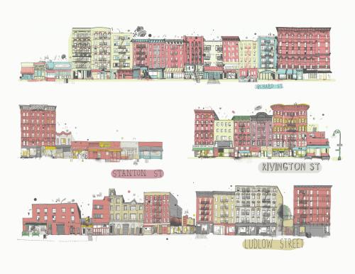
 All the Buildings in New York
 James Gulliver Hancock is drawing all of the buildings in New York City. He’s good at drawing. [via youngna]
03/01/11 |  2
2
Active Tags
Top Tracks
Top Tracks
- Wye Oak
- The Dodos
- Talking Heads
- Lykke Li
- Johnny Flynn
Recent Entries
-
The Art of Queue Jumping
A couple weeks ago, my friend Alaina was telling me about the uniquely Chinese features…
-
I Have a Son and Kidpost is Open to Everybody
I figured it would be a mistake to just write about how Kidpost is now…
-
Kidpost!
It’s been a few months since Facebox, which means it’s time to announce a new…
-
Just the Two of Us: Photos of Cosplayers in Their Homes
Photographer Klaus Pichler has put together a striking photo series of 50 people who love…
-
Holiday Consumption Guides
I am wary of purchasing unnecessary objects for myself or others, but there are several…


