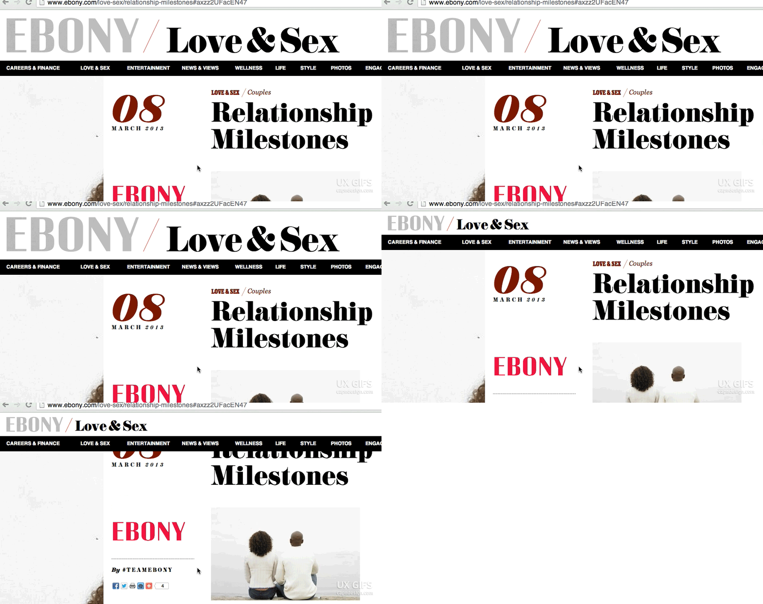
We’ve lived through several years of publications working out what to do with their giant masthead and navigation bars. There’s been plenty of success, but Ebony Magazine has the most elegant I’ve seen. It took a recent inelegant solution (you can ignore the article, obvs) to remind me that this is still a tough thing to do well. Thanks, Ebony!
About this Entry
The entry ‘UX GIFS: Ebony's Masthead’ has 0 comments. It was published at 9:40 AM on July 19, 2013.
Recent Entries
-
A (Ridiculous?) Acquisition Idea for Twitter
Before I explain why, I’m going to say the company: Shazam. Now, take a moment…
-
Toyota Donates Efficiency, Not Money
I want to do this for a living. At a soup kitchen in Harlem, Toyota’s…
-
Sneak peek of Macaw
Macaw is next in line to try and unseat Photoshop as the web designers tool…
-
Why to Kickstart
Today, Spike Lee became the third celebrity to fund a film on Kickstarter and it’s…
-
UX GIFS: Ebony's Masthead
We’ve lived through several years of publications working out what to do with their…