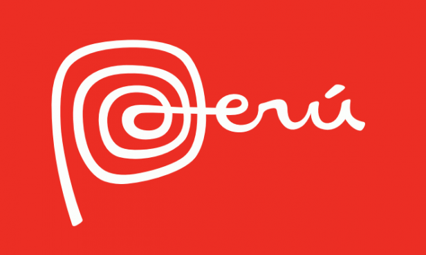
 Peru's New Logo
 Brand New takes a look at my favorite new logo of the year. The swirl of the P is wonderful and is 1000x more interesting than their previous logo. As part of the identity system, they’re also using Bree, which is a font I nearly used on Capn Design.