 The BBC Prepares a New Visual Identity for Its Website
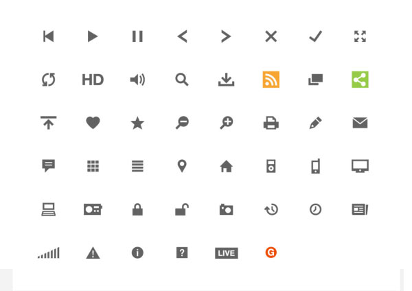
 “We wanted to create something that is flexible enough to allow all our brands their full expression whilst uniting them into a coherent user experience.” Rethinking the identity of a site this large is an undertaking I can barely fathom. I also really liked the simplicity of their new icon set, seen above, which supports their desire to have pages with “a predominantly neutral colour palette with colour being provided by large and dramatic imagery.”