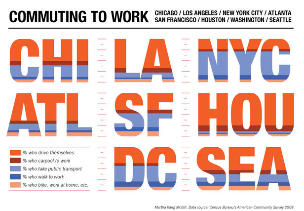
This graphic from Martha Kang McGill shows how people in 8 cities get to work. There are no major surprises (lots of driving in LA and Houston, very little in NYC, DC and SF), but it certainly looks nice. I am curious about why biking was grouped with working at home instead of walking — seems odd. I also wonder why there is relatively little carpooling in New York. If I had to guess, it’d be that people prone to carpooling just take public transport.
I also wish I could find out more about the artist, but Googling didn’t help much. I found the site via David and the via link ends here. I authorize you to Google on my behalf.
02/20/10 11:48 AM
I like this unexpected presentation of the data; makes it very friendly. I wish the very tops and bottoms of roundish letterforms -- C, O, S, U -- didn't get cut off though. It seems like that was done to keep things accurate, but the whole design is so impressionistic already that that decision seems arbitrarily rigorous.