We had another snow day here in New York, so I made this video during lunch.
Putting this together took 10 minutes, including uploading it to Flickr. For all the hemming and hawing about simplifying iMovie, Apple definitely made the right call.
This month I posted 15 entries, crafted 73 tweets, listened to 279 songs, watched 15 videos, bookmarked 4 sites, took 78 photos and favorited 39 things.
We had another snow day here in New York, so I made this video during lunch.
Putting this together took 10 minutes, including uploading it to Flickr. For all the hemming and hawing about simplifying iMovie, Apple definitely made the right call.

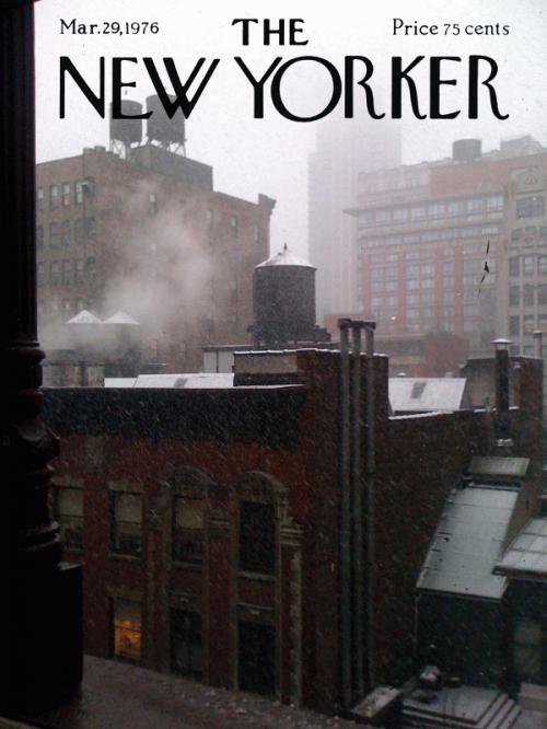
This is a collabo between myself and Finn, who took the photo. If you’re not in New York today, this is what it looks like.
Matt Buchanan of Gizmodo explains how the recently announced Bloom Energy Server works. In short, it’s a new type of fuel cell that will allow business and home owners to cheaply generate their own energy (bonus fact: it runs at 1800°F!). It’s still unclear if they can get the cost low enough for consumers and it is not carbon neutral, but it’s considered a major breakthrough. NYT’s Green Inc. blog has a more general rundown of the device.
An iPhone-friendly jam from the Weightshift crew that makes it easy to find people at SXSWi. I’m looking forward to using this to see where my friends are sitting at panels and avoid my frenemies.
 The Ask, by Sam Lipsyte
 Sam is a funny guy and wrote a book I quite enjoyed (The Subject Steve). This is his newest book and it’s out March 2nd. You can read the first 20 pages at GQ. [via VSL]
 The Big Picture: Backstage during Fashion Week
 The photo essay is so-so, but I do love this photo. It should be up on Slice!
From a New Yorker article on Zappos:
One of these classes, held in a room called the Elvis Presley, happened to contain many bleary-eyed C.L.T. members who had just come from the graveyard shift, where Zappos’s basic assumption of human beings’ essential good nature sometimes rubs up against some uglier truths…[T]here’s the caller who, Zuniga said, will just “breathe kind of hard.” It turns out that there are limits to Zappos’s customer service: callers who truly overstep boundaries are sent to a top-secret eternal hold loop known internally as the Abyss.
That’s funny, but I wonder how they determined that this is the best way to deal with difficult customers. I’m sure they’ve tried a variety of methods, but it seems that admitting this infinite loop exists goes against their experience-based brand. If I were to call them and be put on hold by someone, I’d certainly fear they’ve given up hope for me.
Are there other companies with similar policies? Once you’ve been Abyssed, are you blacklisted?1 I’m sure the law of diminishing returns applies here, but I’d like to think that I’d be given another chance down the road, even if I’d abused my privilege.
Gnilley is a game where you yell and it kills your enemies or opens a secret passage or does something awesome. Instead of explaining it more, I suggest you watch the awesome video.
The video shows a demo made for the Global Game Jam, but they’re working on making a full version. This seems like the perfect game for parties and pissing off your neighbors.
 Accolade's Amazing Box Art
 Panic collects some stunning video game boxes produced by Accolade between 1984 and 1990. The Killed Until Dead box is my favorite and nothing like anything out there now.

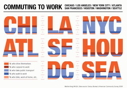
This graphic from Martha Kang McGill shows how people in 8 cities get to work. There are no major surprises (lots of driving in LA and Houston, very little in NYC, DC and SF), but it certainly looks nice. I am curious about why biking was grouped with working at home instead of walking — seems odd. I also wonder why there is relatively little carpooling in New York. If I had to guess, it’d be that people prone to carpooling just take public transport.
I also wish I could find out more about the artist, but Googling didn’t help much. I found the site via David and the via link ends here. I authorize you to Google on my behalf.
 The BBC Prepares a New Visual Identity for Its Website
 “We wanted to create something that is flexible enough to allow all our brands their full expression whilst uniting them into a coherent user experience.” Rethinking the identity of a site this large is an undertaking I can barely fathom. I also really liked the simplicity of their new icon set, seen above, which supports their desire to have pages with “a predominantly neutral colour palette with colour being provided by large and dramatic imagery.”
Yes, I am still 5 months behind on my New Yorkers. For penance, here is a funny Shouts & Murmurs. “All of you ‘Far Horizons’ Fifteenth Tier Plan subscribers may now choose any doctor you like, who will then refer you to the list of approved cheap doctors, ex-doctors, doctors-in-training, and veterinarians.”
 Trade School
 “Take a class every night with a range of specialized teachers in exchange for basic items and services. Secure a spot in a Trade School class by meeting one of the teacher’s barter needs.” My only complaint is that most of the classes are full! [via @lauratitian]
Jim Bumgardner cheats at Foursquare and he’s not ashamed to admit it. He utilized the API to see how far he could go with stealing mayorships and gaining badges.
The “Java Monkeys” [user] got the biggest reactions. Foursquare users get far more irate when they lose mayorship of a Starbucks, as compared to a Statue of Liberty or Mount Rushmore. People are much more attached to the small places they visit over and over, and have some personal investment in. The smaller the venue, the bigger the value.
Whew. This took way too long, but here we are with a new design! I am loath to admit that I’ve been building this off and on for 2 years, but it’s true. Let me give you the rundown.
I’ve long pined for the beautiful structure of Khoi’s blog and the free-flowing nature of Jason’s. I’d like to think I created something original that draws from what they’ve been doing for years.
The fonts in use are FF Tisa Web Pro, FF Enzo Web and Verdana (my commitment to chunky sans-serif fonts continues in this latest iteration.). The first two are served from Typekit1, which has been a fun experiment.
As for the colors, I just wanted something bright and fun. I tried to make use of the color as an accent instead of blinding you with a yellow background or blue body text (don’t cross me or I just might). I think the color choices are the most successful aspect of the site.
Like most of you, I’ve been Twittering and Flickring for quite some time, and I wanted to get that onto the site. Sure, I could have used the widgets they provide or even the action streams provided by Movable Type, but that would have been “fast” and “easy”. So, I wrote a set of scripts that grab data, parse it and write out some interesting widgets throughout the site. Some of this stuff is a little buggy, but for the most part it turned out well.
You can see good examples of this by looking at the monthly archives, which only have data from that month, instead of just the most recent. I wanted it to be a view into what I did for the month (probably more for me than you, when I think about it). The homepage has some nice views as well. You’ll notice a graph for the top Last.fm tracks. I built that using Highcharts, which is a jQuery graphing library. I’ve been playing around with these for a few months now — mostly at work — and this one is the most full-featured. I also really like Bluff.
Since this is only bringing in data about what happened and when it happened, I’m also reviving reviews. I haven’t reviewed anything here since 2005, but that will change post haste.
The site is powered by Movable Type 4.33, several MT plugins, jQuery, Typekit and the custom social graph scripts I wrote. While everyone else is moving to hosted blogging solutions, some of which are awesome, I’m still a tinkerer. I want to be able to dive in and play with the code. It forces me to learn new tricks, even if I occasionally have to debug an errant template.
I’m using jQuery in some fun ways around the site. You’ll notice at the bottom of the home page you can load new entries. “But Matt, how is that possible if you use a CMS that publishes static files?” Well, in MT 4.3 I helped usher in the ability to paginate entries and I thought it was only appropriate I put it in action here.
Another change is the addition of authenticated commenting and tags. You can still comment anonymously, but now Facebook, TypePad, Google and Yahoo! users can log in and keep their identities. In regards to tags, I’ve been adding them to entries for a while now, but I’ve gotten around to exposing them.
Finally, I have dropped support for IE6. Only 3% of my visitors use the browser, so sorry dudes. You’re out of luck. The site does still have some issues in IE7 and 8, but I’ll fix those over the next week or two. Ya’ll can read the content just fine, so I think we can both wait a bit.
I’ve been blogging for over ten years (yeah the archives only go back to December 2000, but I lost some old hand-coded entries) and I feel like this is the first design I’ll be able to (intentionally) keep going for some time. I also feel like it represents who I am right now.2
If you happen to find anything that looks odd, feel free to let me know. You can find contact information on the about page or just leave a comment here.
Thanks to everyone for visiting over the years. It’s been fun so far and I’m looking forward to many more years of funning with you.
A couple weeks ago, my friend Alaina was telling me about the uniquely Chinese features…
I figured it would be a mistake to just write about how Kidpost is now…
It’s been a few months since Facebox, which means it’s time to announce a new…
Photographer Klaus Pichler has put together a striking photo series of 50 people who love…
I am wary of purchasing unnecessary objects for myself or others, but there are several…