The Making of GTA IV Edge Magazine's incredibly long feature on Grand Theft Auto 4. I just finished this today and it provides a comprehensive background of the thought process behind the series and this iteration. Here's part 2. If you're a nerd like me, find a copy of Edge 187 to see this article in all of its glossy-paged glory.
Beer Menus They have 150 NYC bars and 1200 beers in their database. Even for an occasional beer drinker, this is an awesome resource. [via gothamist]
Excelsior 1968 Robot Johnny just released a book of caricatures of everyone in his mom's high school class. You can see all the photos on flickr.
50 Ways to Help the Planet Wire & Twine compile a well-designed list of easy ways to lower consumption and save energy.
Posted April 21, 2008
Wednesday of last week I went to see three partners from Pentagram — Paula Scher, Michael Bierut and Michael Gericke — present "Designing New York’s Visual Identity" at the Museum of the City of New York. Most of the pieces weren't new to me, but the discussion portion got my mind stirring.
One of the Michaels, I believe it was Bierut, mentioned his preference for redesigns over creating new branding. Responding to a question about how to deal with poorly received design, Scher explained that this is actually a failure in understanding the client's needs. Together, these points got me thinking about the anxiety that comes with new design projects.
I enjoy design work, but I often get frustrated when there isn't a clearly defined set of problems. Redesigns tend to be easier because the questions are clearer. Not only do you have an existing model for reference, but the client has a better sense of what's missing in the current setup.
The key to keeping frustrations at bay is defining as many questions and answers as possible before putting pen to paper. If you don't have all the questions, go back to the client. If you don't have all the answers, go to your coworkers or peers. It sounds simple, but it's something I rarely remember to do when I'm feeling stressed.
Hard Times by Matt Mason and Nicholas Felton Another beautiful piece of design from Feltron for the We Tell Stories series [via Naz]
The Dielene Lots of great product design. Who knew there were so many people doing good work?
Mutiny Bikes BMX Video in HD The tricks won't blow your mind, but it's shot beautifully. We need more BMX and skate videos in HD. [via keith]
Cookie Monster Wonders: Is Me Monster? "Me don't think me is monster. Me just furry blue person who love cookies too much. Me no ask for it. Me just born that way." Oh man, this killed me. [via Airbag]
Photos from Nike's Beijing Olympics Media Event Tons of interesting new technology and a whole lot of beautiful design. Check out Nike Media for more details
Posted April 8, 2008
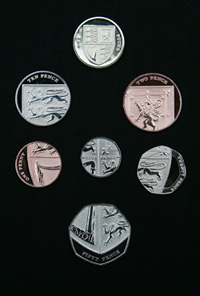
 I'm floored by Britain's new coinage, designed by Matthew Dent, a 26 year-old graphic design student. They're based on the British Royal Arms and all form a piece of the whole. For a little more explanation and some history, be sure to watch the video.
On the other hand, the MySpace-ification of U.S. money continues with the new five dollar bill. Technically impressive, completely uninspired and totally American.
 I'm floored by


