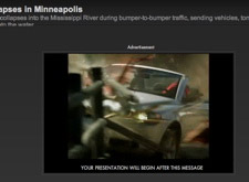
Poynter's E-Media Tidbits called foul on the Washington Post for display an ad before a slideshow from the bridge collapse. They're absolutely right, it's completely distasteful. A smart commenter points out that tragedy drives a lot of traffic. So what to do?
To me, the issue is the way the ad was deployed and not its right to exist. Anything that keeps me from viewing content is going to cause frustration and when I am already distraught, my patience is non-existent. Whether it was due to the blog post or some other factor, the ad is now down. There is still an ad above the slideshow, but no on seems up in arms about it.
What really matters is respecting the mood of your audience. My best example is my local Fox newscast. No, I'm not talking about the ads between the segments, I'm talking about the news itself. I remember one time just after 9/11 when there was a teaser for the 9pm news that went something like this:
News lady: We speak to a family of one of the THREE THOUSAND killed.
News man: Two men were found brutally murdered by a group of unruly teens
News lady: Here comes fall fashion!
News man: Is your house safe from lead poisoning? FIND OUT.
News lady: Indian summer just won't quit!
All of this happened without skipping a beat and I nearly vommitted. In the end, it comes down to common sense. WaPo is a huge national newspaper and I'm sure leaving the ad there was accidental. From the brief glimpse, it appears to be an ad featuring a car racing around tight corners and I don't think they're stupid enough to leave that running intentionally.
08/10/07 10:59 AM
My thoughts exactly. And even when they aren't trying to take advantage of a particular situation, in-your-face advertising often seems inappropriate when mixed with hard news.
The New York Times runs an ad for a phone in which the phone escapes the confines of the banner, runs around the page, and in many cases ends up over the main story image while it waggles around trying to impress with it's cutesyness. Not the best thing to do when that image is a searing picture of murdered genocide victims or recently collapsed bridges.
The people that run newspapers still haven't learned google's main lesson: People respond best to fewer less obtrusive but more contextually relevant ads.