Capn Design

March 2007

This month I posted 38 entries, crafted 14 tweets, listened to 386 songs, watched 6 videos, bookmarked 8 sites, took 2 photos and favorited 2 things.

The Album Will Not Die

Posted March 29, 2007

I just finished reading the Wired issue on Snack Culture, which contained the umpteenth reference to the impending death of the album that I've seen in 2007. You've probably noticed it too as the Wall Street Journal broke news of a 20% decline in album sales in the first quarter of this year and everyone else added their two cents (hello). I'm here to say the album will never die and here are two reasons why.

1. Making a Hit Song is Hard / This is a Business

Like most things in life, the top 10% of artists account for 90% of album sales. Of those top albums, only 1-4 songs on each drive all of the sales; the rest is oftentimes filler. Wired notes that the move from an unskippable, analog record to a chunked, digital file makes avoiding these leftovers much easier.

Despite a seemingly logical progression, making music is art and most musicians (JT excluded) will not get it right on the first shot. In other words, they're going to record 20-30 songs to get a handful of good ones and several more worth your time. If one of good songs gets a bunch of radio play, why would the label sit on product that people want to hear? The album will live on as a result, even if more artists start out with a single, with full albums being sold at a discount over purchasing each song individually.


A footnote, but definitely worth noting, is that a good chunk of an album's budget is devoted to marketing. When you release five singles on a new artist in hopes of landing a hit you're going to spend quite a bit more money than you would when releasing ana album.

2. Indie Bands Don't Need Singles / Finding New Artists is Easy

The Arcade Fire and Clap Your Hands Say Yeah sold a boatload of records and neither had a hit single. There are another half-dozen bands in their position and hundreds (thousands?) more making a healthy living with a modicum of mainstream radio exposure. No one knew these two bands were going to be huge before their debut albums released and releasing one or two singles makes almost no sense without a decent marketing budget. More importantly, a high percentage of these bands didn't get into music to get rich and are just happy to make a decent living doing what they love (I assume this is why Clap Your Hands decided to release their newest album themselves).

For those small artists looking to strike it big, releasing more songs can only help their cause. With search tools improving and a dozen new MP3 blogs starting every day, casting a wider net could make the difference. These two factors also begin to make the long tail much more valuable. People looking for something outside the mainstream are increasingly likely to find something that suits them, which will increase indie album sales (I'd guess there are figures to back me up somewhere, but if they exist I certainly don't have access to them).

We all know the music business is changing and album sales will continue to decline as people stop buying every track on Reuben Studdard's album, but the hit-makers are tiny fraction of the music business. When this all shakes out I'll be surprised if at least one major label doesn't go belly-up, but I have total faith in the industry. In fact, I'm guessing this sea change will help more musicians make a living as an artist and that's a very good thing.

For further reading, Steven Johnson agreed the album will live on, but he had a different reason. "Freed from the time restrictions of traditional media, we're developing a more nuanced awareness of the right length for different kinds of cultural experiences."
BAM Sends a Super-Useful Email

Posted March 28, 2007

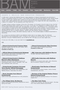
20070328bamemail.gifTonight I'm going to see the dance performance of Edward Scissorhands at BAM. This morning they sent me the email you see at the right (click on it to see it larger) that has tons of great information about the performance.

First, there's a letter from BAM's Executive Producer with his thoughts on Matthew Bourne (the director) and the play in general. Then there are a ton of links to reviews, video snippets of the performance and interviews with and articles about Matthew Bourne. At the bottom there's a little info about the show and a link to more and details on BAM (directions, food options, etc.). This is a fantastic way to help their patrons improve their enjoyment of the show and I'm going to print out a few of these interviews to read as I wait for the lights to dim.

Now I just want every other venue to do the same thing. Imagine getting an email with links about the production of 300 or interviews with James Murphy of LCD Soundsystem before his show at the Bowery Ballroom. The last thing we need is a way to continue the conversation after the event is finished.

If anyone wants to create a service that provides this info to venues with me (or without me), I think we/you would make a whole lot of money.

(Note: I couldn't actually post the HTML because all the links are coded to me, but if you go to BAM's Edward Scissorhands page you'll get almost all of the information.)

The Erosion Sink

Posted March 27, 2007

20070327erosionsink.jpg

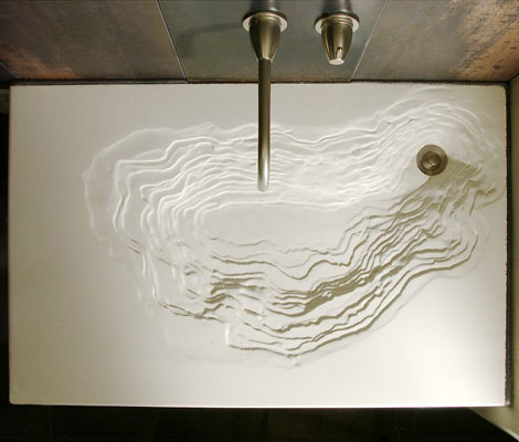
While looking at Organic Architect's 2007 Awards, I came across the Erosion Sink again and thought, "I'm glad I blogged about that a few months ago." Well, turns out I didn't. It may just be a sink and there is pretty good chance water would splatter when you use it, but this is a piece of art and you deserve to see it.

The sink is built by Gore Design and is made with eco-friendly materials. Unfortunately, all of the posts I could find are similar to mine (eco-friendly and fucking awesome!), but I'm quite curious about how this was created. Maybe this post will be the tipping point and HGTV will interview the designers for me. Get to it, people.

Another Video of Jeff Han Demoing Multitouch

This time he talks!

Shake Shack Cam Widget

And to think, I tried to make my own this weekend! This is awesome/necessary.

Roommate Wanted: Share My West Village Pad

a McSweeney's story [via kottke]

Brooklyn May Get Free Netflix from the Public Library

The Brooklyn Library says it's cheaper to give free Netflix than stock all 60 branches. Sounds great to me!

Parody of Nike Air Force One Commercial

It isn't amazing, but I'm pointing it out because I saw it well before I saw the parody on this week's SNL. Did SNL steal it? Probably not, as there aren't a ton of views, but I thought I'd give them credit.

The Eco-Friendly 7.83Hz House

Posted March 22, 2007

20070323archicteture_1.jpgI often forget how much I enjoy architecture, efficient design and the conjuction of the two. Wired's recent section on green homes reminded me about how much exciting work is out there and got me jonesing for more.

Treehugger's post about a new British project called the 7.83hz House (named for the Schumann Resonance, which is the frequency of the earth's vibration) really stuck out as a fantastic idea. The architects, Simon Beames and Simon Dickens, realized it was possible to create a beautiful, eco-friendly home by using biodynamically grown wood products, going pre-fab and only using dowels instead of wood glue (a little nerve wracking but they seem trustworthy). As the original article from the April issue of Dwell explains, these glues usually give off formaldahyde, i.e. the substance that created this. As Beames says in the article, "[People] eat organic foods, but what are they sitting in?"

Being eco-friendly isn't enough though. My favorite feature is the modularity of the project. "The interior can be altered as families grow or shrink, with floors added to create new bedrooms and removed to create double-height living rooms or even a roof garden." The houses are also built to be grouped together for those want to stay close to friends or become an entrepreneur. While this is fantastically awesome, the best feature is the price: $170,000 without the cost of land. While land ain't cheap, this puts the 7.83Hz house within the grasps of those who aren't CEOs of technology companies or ex-Vice Presidents.

20070323archicteture_2.jpg

Rumor has it, Youmeheshe (the firm's name) is bringing the design stateside, so getting one of these in the near-future is a reality for one or two of my readers. If you want a closer look, the firm has posted more photos to flickr.

David Mamet Guest-Programs TCM Tonight

Of the four films showing, I've set the Tivo to record Le Jour Se Leve and The Killing [via Dangerous Universe]

You Can Tickle a Rat!

Whodathunkit. [via Make]

A-B Testing with Menu Items

Freakonomics mastermind Steven Levitt noticed a local restaurant used two names for the same item on different menus. This, and Danny Meyer's relentless efforts to improve Shake Shack, reminds me that fine-tuning the details makes all the difference.

Turbo Speedclock Oven

Cooks foods 80% faster (12 lb. turkey in 42 minutes) than a traditional oven with columns of super-heated air and microwaves. Downside: It costs about $7,500.

Today's Best Albums

Posted March 20, 2007

Don't expect this to be a regular feature, but there are two fantastic albums coming out today that I've been listening to for a while.

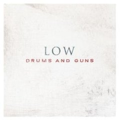
Low - Drums & Guns

20070320_albums_1.jpgI've been listening to this album for several weeks and I'm ecstatic that they were able to improve upon their last two albums, The Great Destroyer and Things We Lost in the Fire. Low is usually classified as slo-core, but they've been starting rock a little more. I'm a big fan of the triple play of "Hatchet", "Your Poison" and "Take Your Time" about 2/3 of the way through the album.

Buy Drums & Guns

Andrew Bird - Armchair Apocrypha

20070320_albums_2.jpgI had loosely followed Andrew Bird for a while, but got sucked in last year with the release of Andrew Bird and the Mysterious Production of Eggs. The new album has a very similar feel but is a bit more mellow. More than anything else, it's his hypnotic vocals that bring me back to his songs. The new album doesn't disappoint in this regard and is a great companion to Eggs. An interesting note, apocrypha can be defined as, "...works that in their title, form, and contents resemble books of the Old and New Testaments, but that are not accepted as true biblical books" (a.k.a. armchair religious person, like armchair quarterback).

Buy Armchair Apocrypha

A Conversation at the Grownup Table, as Imagined at the Kids' Table

"GRANDMOTHER: Did you see the politics? It made me angry. DAD: Me, too. When it was over, I had sex. UNCLE: I'm having sex right now. DAD: We all are." [via waxy]

Has a Sitcom Ever Permanently Changed Its Primary Location?

My friend Rick asks the tough question but he can only come up with one, The Mary Tyler Moore Show. Don't know why I'm so curious, but comment on his entry if you have any other examples.

His Energy Bill is $0.00

Man Uses solar and hydrogen energy technologies to create all of his own energy. I can't wait until the day when we all are carbon neutral and energy independent.

Astronaut Tools

Considering the amount of money spent on engineering, it makes sense that these are so cool [via boing boing]

One Number That Will Ring All Your Phones

GrandCentral.com gives you one phone number that rings all your numbers at once. Best feature? At the beginning of each call you hear, "Press 1 to accept, 2 to send to voice mail, 3 to listen in on voice mail, or 4 to accept and record the call." That's just the beginning.

Walgreens Marks Up Generic Drugs 975%!

Ridiculous. It'd be cheaper to get a membership at Costco AND get the drugs.

Anti-Theft Coffee Cup

There's a small plug in the side that you remove when it's not in use.

Video: Sick French Beat-boxing From French American Idol
Web Typography Sucks

Basics for web typography; download the pdf that includes notes

Real-Life Wireframe of a Car
50 States in a Week Vacation

As someone who enjoys challenges like this (seven movies in a day!), this was a ton of fun to read [via kottke]

Rap Cat

It's Friday.

Video: LittleBigPlanet for the PS3

Collaborative game that looks like so much fun. Unfortunately, I may have to find someone with a PS3 and buy this for them as it's not (quite) worth $700 to play this.

I Believe in Multi-touch

Posted March 7, 2007

As we know, the iPhone's killer app is multi-touch, which allows you to use both hands to adjust on-screen elements. It lets you do cool things like resize photos and easily navigate contacts, emails or whatever. It's pretty cool.

Last week, Steven Berlin Johnson, who happens to be an author I quite enjoy, dreamed up a beautiful Apple rumor — multi-touch everywhere. I'll let you read his post, but the gist is that the new Apple monitors, that are rumored to be released soon, will be touch-screen enabled. Steven's rumor makes tons of sense as it explains a ton of old rumors and hard facts.

Some folks, specifically Gizmodo's Brian Lam, think multi-touch is dumb. Brian says, "I like my trackpad. I never have to take my hands off the keyboard to move my pointer." The post is almost certainly tongue-in-cheek, but if this rumor comes to fruition there will be plenty of people who cry foul, saying it's too big of a change.

I am here to preemptively tell these people to shove it, and here's why. As LCD prices get cheaper and our use of computers for entertainment viewing increases, we'll start using larger and larger screens. Those who have used large screens know that dragging a mouse from one end to the other is slow and a pain. Multi-touch would solve this problem for many applications.

Paradigm shifts are never easy, but I think multi-touch will greatly increase productivity. iPhoto still doesn't compare to having a stack of photos spread out on a counter top and I'm confident this new technology will make daily computing tasks more, not less, intuitive.

For those that need a little more convincing or background, watch this video for examples of multi-touch in use.

Two Sneakers: One You Can Buy, One You Can't

Posted March 5, 2007

20070305sneakers2.jpg

Orange Crackle Dunk Highs

These are new hi-top Dunks that were previewed by Fat Lace. They're supposed to come out this summer along with the slew of other shoes previewed on that page. I think the combination of colors and textures make this one pretty fantastic.

20070305sneakers1.jpg

Custom Nike Air Jordan I

Oftentimes, a shoe is made as a sample or as an exclusive gift for someone. In this case, Hybebeast claims these were a gift made for an employee of UNDFTD (an exclusive sneaker chain). Too bad, as I really liked these and would be happy to grab a pair. (The original photo is courtesy of Weekly Drop.)

Short Story: They're Made of Meat

Written by Terry Bisson (and linked everywhere).

Will In-Game Transactions Become Taxable?

As of today, only if you sell your Linden dollars (or whatever) for recognized currency is it taxable, but as these virtual worlds get bigger it will open a monstrous can of worms.

Tokyo Apartments Keep You on Your Toes to Activate Your Brain

"Inside, each apartment features a dining room with a grainy, surfaced floor that slopes erratically, a sunken kitchen and a study with a concave floor. Electric switches are located in unexpected places on the walls so you have to feel around for the right one. A glass door to the veranda is so small you have to bend to crawl out. You constantly lose balance and gather yourself up, grab onto a column and occasionally trip and fall." [via Caterina]

NYT Does Pop-Up Definitions

Posted March 2, 2007

While reading the review for Black Snake Moan at the NY Times, I came across a word I didn't know: cornpone. So, I double-clicked it so I could copy and paste it into the google search window. Before I could reach the letter C, a window had popped up with the definition. This is the perfect execution of a feature I've always wanted. I'm surprised it's taken this long to surface.

If you want to try it yourself, you should give it a shot with Firefox first. It may work in IE, but it definitely doesn't work in Safari. Also, it only seems to work on article pages. Here's a video of the pop-up in action (you can't quite the see the double-clicking and highlighting thanks to compression by Snapz Pro and Youtube):

Advertising and Design in the (Pretend) Future

Posted March 2, 2007

When you make a film set in the future, you're forced to predict how society will differ. Two films that came out last year, Idiocracy and Children of Men, both provided their own perspectives.

Idiocracy

Idiocracy is set 500 years in the future and assumes everyone is unbelievably stupid. Speak Up provides screen-caps of ads from the movie that show off our faux progeny's brilliance. One thing they don't show is the disposable clothes that are covered in ads, a la Nascar.

Children of Men

Children of Men looks at a future where women are infertile and a class war is past its breaking point. These ads aren't as much of a stretch, but still are interesting.

(Side note: both movies are good, but I preferred Children of Men, even if Brawndo has electrolytes.)

Alphabet 26

"It is misleading for a letter, or for any graphic symbol, to have two different designs. Confusion might set in when school children are taught to recognize words even before they have learned to recognize different symbols for the same letter."

Video of a Typographic Version of a Pulp Fiction Speech

[via Signal vs. Noise]

Art Installation of 1550 Chairs Stacked Between Two Buildings

Created for the Instanbul Biennale in 2003 by Doris Salcedo. This page has a bigger version and another view. I'd love to see this in person.

USAToday.com Embraces Blog Design

Posted March 1, 2007

20070301usatoday.gifJeff Jarvis got a heads up about the USAToday.com redesign (hat tip to Khoi) and I'm loving the way it looks. Rather, I'm loving the information architecture.

One of my favorite features of blog design is the ability to have a long scroll of articles on the front page, with interior pages using more categorization and hierarchy. As you can see to the right, USA Today's homepage has a long scroll of the most recent articles down the right side of the page. They also have incorporated a lot of other bloggy features (comments and tags, most notably), which is interesting but I'm skeptical about the quality of comments coming in (assuming they're not moderated).

While the NY Times is my preferred news source, the design is still based on the look and feel of a broadsheet. The amount of information and five main columns is just too much to digest for me. Clearly there is a lot of information that needs to be presented, but I don't think giving it to us all at once is the answer.

Jarvis touches on the subject in a more general way, saying, "In fact, since most visitors to most news sites I know don’t even go to the home page in a day, I think the next frontier of design will be about exploding home pages and sites in a looser network of distributed content." Exactly. Since there will inevitably be a homepage for every media company, don't make assumptions about what people want to see. Give us the biggest news in one area, and a stream of the most recent news and stories in the other.

More: USA Today's Announcement

Update (3/5/07): The new USAToday.com is live.

Top Tracks

Recent Entries