The 2006 Major League Baseball season has begun (the Cubs won their first game 16-7; woo) and I'm psyched. Lots of potential drama with high-profile trades, signings and steroid allegations in the off-season. But now that the season has arrived, how are you going to keep abreast of games whilst toiling about at your job? You'll use your trusty game- channel/tracker/day/log from one of your favorite sports sites. Because I'm a sucker for good information design, I thought I'd walk you through the four major options you have for realtime game tracking. Three of them are brand new and ones an old standby. Also, the new ones have a few bugs but I won't poo-poo them as the software has only been in use for a couple days.

I'm going to take you through the paces after the jump, but you should also consider trying mlb.tv, which lets you watch games online for $79.95 a year, or Gameday Audio, which only gives you audio but is an easier pill to swallow at $14.95 for the season.
MLB.com Gameday
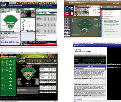
Of the four options I'll be showing you, this is the only that existed before this season. I've also used it over the last two seasons, so I may be a bit biased. That being said, I think this may be the best of the bunch. Above all else, it offers the most information (without clicking) in the second smallest space. Yahoo! and ESPN have sexier options, but you've got to do more clicking to get the information you want.
Pros:
- Rolling over player headshots gives their line for the day, over fielders gives fielding percentage and over runners gives stolen bases
- The data is updated incredibly quickly
- Very utilitarian design allows for maximum amount of information
Cons:
- The utilitarian design ain't pretty, even if it works
- Switching between games is slow and only scores are provided for other games
- The small space devoted to the game log is an issue for innings with a lot of activity
ESPN.com Gamecast

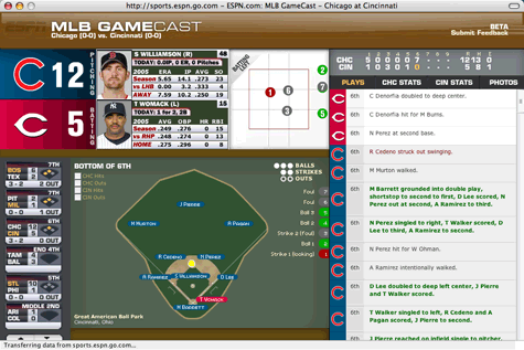
Like any good piece of Web 2.0 software, this newcomer is still in beta. I think these people think it says betta. ESPN.com has a habit of making beautiful pages and this is no exception. Of course, you ought to have broadband and a big monitor if you want to use this puppy. Although I've only watch parts of a couple games with this, it's growing on me a lot and could rival MLB.com's offering. Their integration of Todd Dominey's Slideshow Pro is slick.
Pros:
- The color palette makes it very easy to take stock of a game's status quickly
- The game log is large and easy to read. You can scroll through the whole game.
- The graphics are just fun. When a ball is hit the pitch and hit are animated in a very Baseball manner.
Cons:
- It's incredibly hard to figure out how to only view scoring plays (you click on the score above the log)
- The window is 960 pixels wide. Way too big. I think the header is at least 100px tall.
- Infomation about current batter and pitcher is crammed in. Spacing and font choices make it hard to read.
Yahoo! Gamechannel

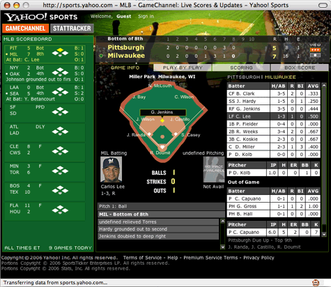
I've learned to prefer Yahoo! over ESPN for football, but I don't know if that's the case here. Yahoo! continues their focus on fantasy players, which makes sense based on the number of them, by devoting a lot of real estate to to other games around the league. Unfortunately, I think it forces you to do too much clicking to see all the information about the game you're supposed to be following. I don't see myself using this much during the season.
Pros:
- Lack of annoying video. It's the only one that doesn't force you to watch dumb videos between innings.
- Information on other games shows baserunners, outs, score and last play
- Good scoring alerts
Cons:
- The design is blah and feels a little cramped.
- The play-by-play is too wide and tough to read.
- There's no way to see who is on the bench.
CBS Sportsline Glog

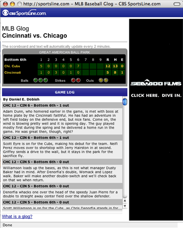
Yes, they are calling it a glog. What is a glog? "It's an expert color commentary of the contest at hand - not just what happened but why and how it affects the rest of the game." Well, dumb name but an interesting concept. Looks obviously aren't a priority, so they've got to rely on writing. Thus far, the writing is really dry, but it does provide the subjectivity that's missing from our other options.
Pros:
- Uh, an actual perspective on the game.
- Yeah, that's it.
Cons:
- Not even a box score.
- I just want a little more personality. Lines like, "I could swear I felt a breeze sitting at my computer" aren't gonna cut it.
Conclusion
None of these newcomers really had what it takes to knock off MLB.com's Gameday. It's not the best looking, but it does what I need. ESPN's offering has potential, but it's size is a definite problem. Even if you have a 1024x768 monitor it'll take up the entire screen. That's far too big to watch at work. Still, I'm excited the newcomers are pushing the boundries as it'll hopefully lead to more innovation. As these applications get better, the experience may eventually be better than watching the game.

04/28/06 8:41 PM
MLB Gameday had a mini option last year, I don't suppose you've figured out where that got to? I miss it.