The Race for the Nomination
This graphic is from the New York Times and shows the primary results. It appears that new information is automatically loaded each time you select a new section. My favorite graphics are the "Results by Candidate," and "Bush's Approval Rating" (pictured below).

State-By-State Comparison on Same-Sex Marriages
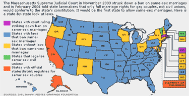
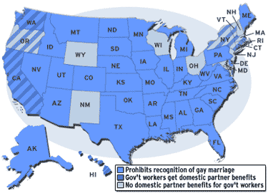
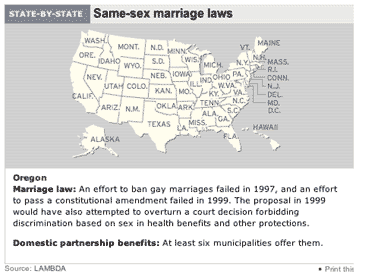
This one comes from CNN and isn't all that graphically pleasing, but it is incredibly user-friendly. I looked at a similar graphic from CBS.com, which is much more difficult to understand, and realized the CNN one is quite effective. Below are graphics from a number of major news sources. You can decide which one is the best. (The graphics at their original size.)
CNN

CBS

MSNBC

If you know of others, gimmie a holler via email (on the left).